There are usually two key aspects in a redesign project: Organizing existing features to improve usability and incorporate new features to extend product capabilities. An information architecture with efficient and scalable organization and navigation systems can facilitate feature organization and new features integration, and at the same time, keep interface simple and neat. For instance, in this project, the new intuitive quick link editing interaction model not only simplified link editing, its tab structure also sets the foundation for quickly incorporate the new batch link import feature.
Client
A Fortune 500 Insurance Company in U.S.
Duration
3 months, 2022
Team
Researchers, Project Managers
Role
Product Design
A robust and tailored intranet experience vision design for 13,500+ employees.

Overview
The Context
HomeSafe is a Fortune 500 insurance company with 6 operating brands based in Madison, WI. Compass is the unified intranet portal and a critical daily touchpoint for all its 13,500 employees. As HomeSafe acquires more insurance brands, seeking opportunities to standardize and improve Compass experience is desired.
The Goal
How might we envision Compass experience that effectively provides work supports, better connects employees across the organization, enables more actions, and informs and inspires employees with data and stories?
Final Design
Robust homepage experience enabled by a new scalable layout
I designed 15+ new homepage widgets to meet different user groups’ needs for getting informed, connecting with the org, and taking actions. Higher-priority features are placed above the fold for easy access.
Simple contextual widget customization
Homepage widgets can be easily deleted, moved, and added directly in context in the customization mode based on users’ needs and preferences.
An intuitive interaction model for quickly accessing work tools
Users can access the links to their work tools from any page and easily customize links based on their need. Curated sets of links are also provided based on roles.
An enhanced search feature with predictive search and result previews
A list of features were added to shorten the paths from questions to answers, including search histories, auto-complete, search result snippets, quick actions, and intuitive filters.
Manage time off and expense in one place
I designed a new time & corporate expense landing page for employees to quickly access all related content and tools and take relevant actions.
A new onboarding system to help employees grow their career
I designed an onboarding modal that can be used for onboarding tips and new features introduction. A new dedicated onboarding hub is also available for more content and resources.
Research
1. Diagnose current intranet UI
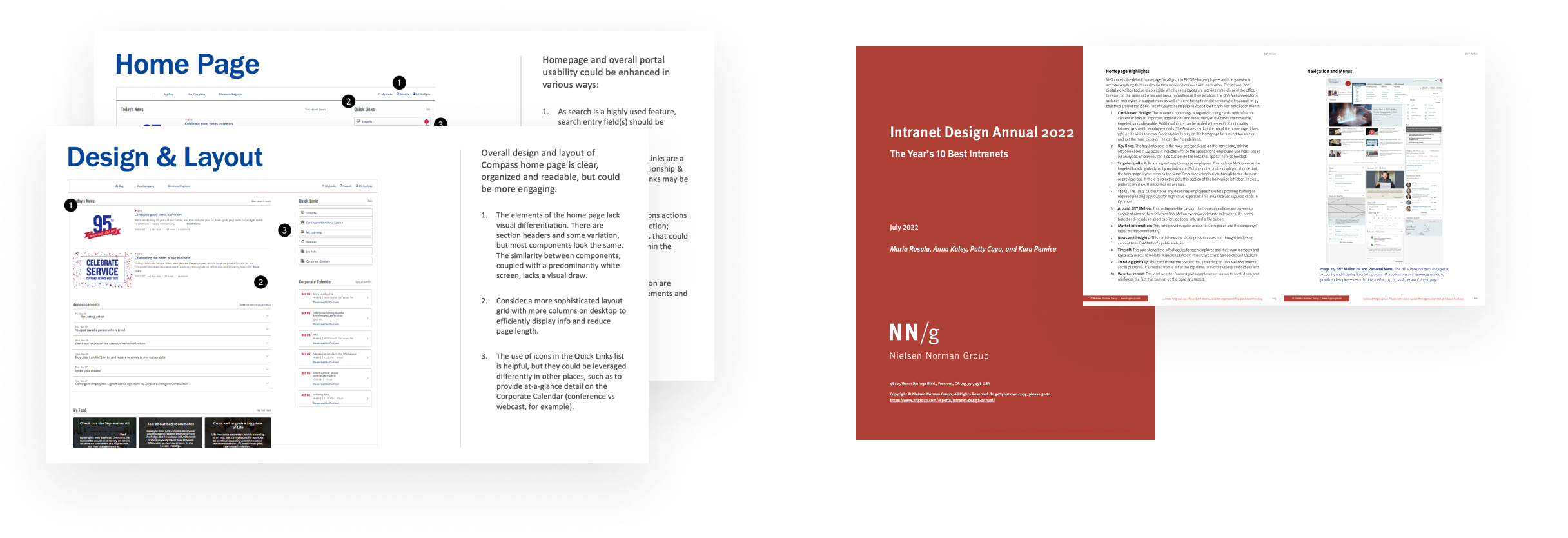
I contributed to the usability assessment for the current UI. Key aspects include consistency, clarity, flexibility, visibility, and error prevention. The overall experience was generally effective and usable but we can make search feature more prominent and enable faceted search across all result types. And we can leverage modern design languages (flexible grids, iconography, etc.) to efficiently display info without looking stark. I also reviewed N/NG intranet reports to understand best practices in intranet design field.
2. Learn user needs from interviews
The team interviewed 15 employees from all 6 operating companies. We made 2 personas for new hires and experienced employees, and summarized their high-priority needs.

3. Ideate and prioritize concepts
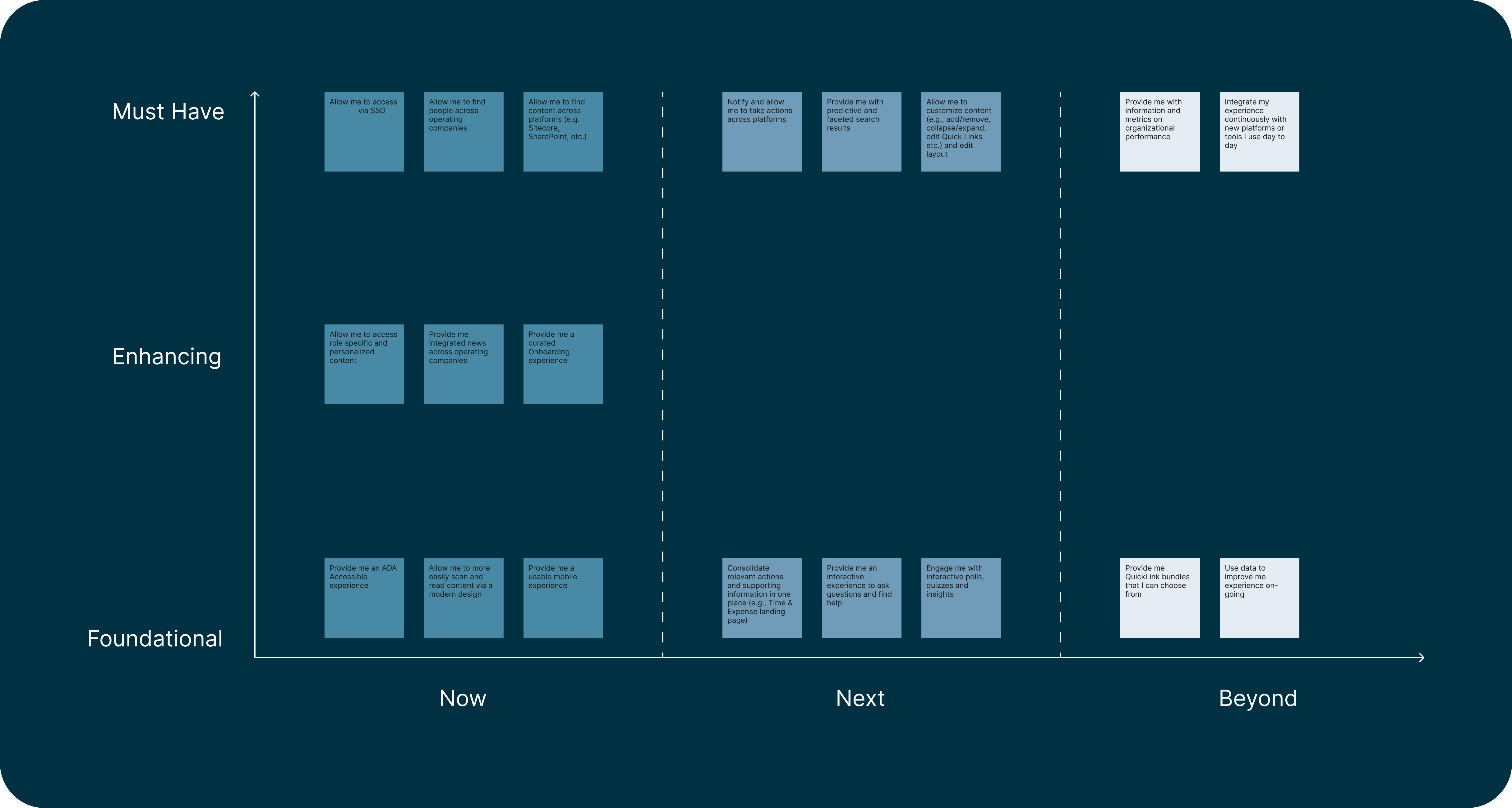
The team conducted a co-design workshop with stakeholders to generate new features and prioritize them using an effort & impact matrix. Finally we mapped these features into 6 capabilities based on the scope and themes: Homepage, search, customization, notification, onboarding, and thematic landing pages.
Design process (1): An intuitive link feature
Problems & Goal
Links feature is important for users to access their work related tools. Users are able to add, delete, and reorder links. I discovered 2 problems:
- Confusing terminology and interaction models: Currently all links are separated into two parts with two terms: The user can access maximum 6 links called “Quick links” on the top right corner of the homepage. For viewing more links, they need to click on “My Links” on navigation bar to open a dropdown to see all their links. The design of one feature in two place causes inconvenience and low efficiency.
- Unintuitive link editing feature: Links are displayed in a list format but the user needs to jump into a new page to customize links in a messy table format.
Therefore, my goal is to redesign the Links feature to simplify the interaction models of link display and link customization for ease of use.
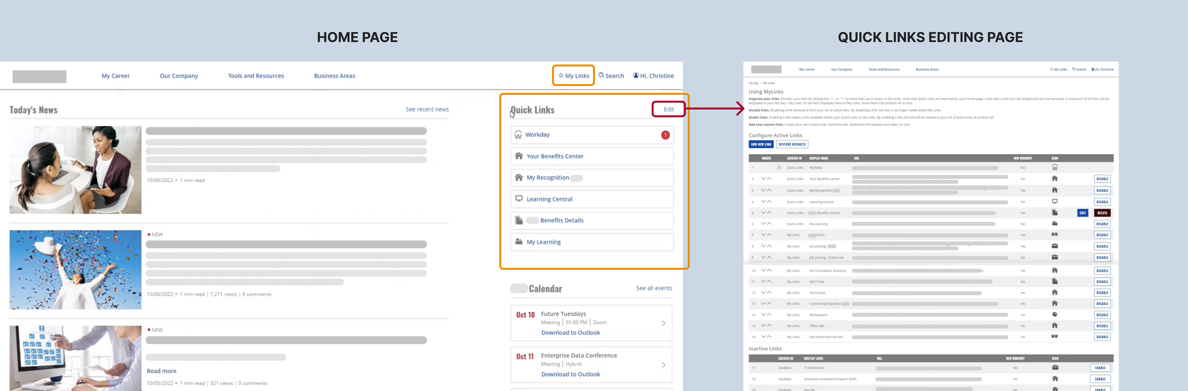
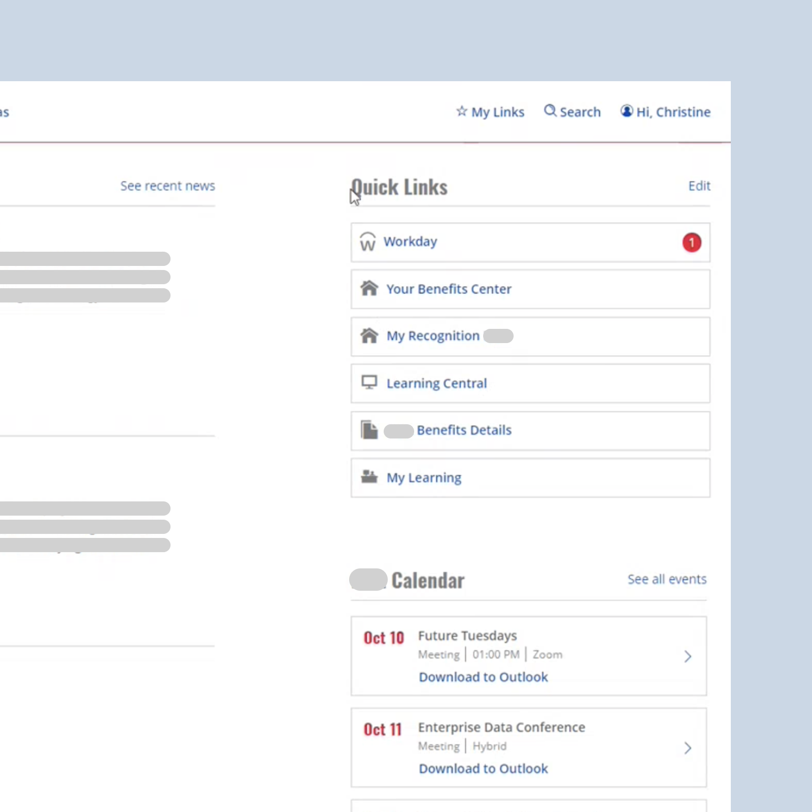
Link display interaction model redesign
I consolidated Quick Links and My Links by putting all links in an expandable grid widget with 6 links exposed by default.
- Simplicity: All links can be accessed in one place. The user can just one click to expand the grid to view all links.
- Efficiency: The icon-centered 3-column grid saves more vertical screen real estate.
- Flexibility: User can still access all links in a consistent way on any page by clicking on Quick Links action on the global navigation bar.
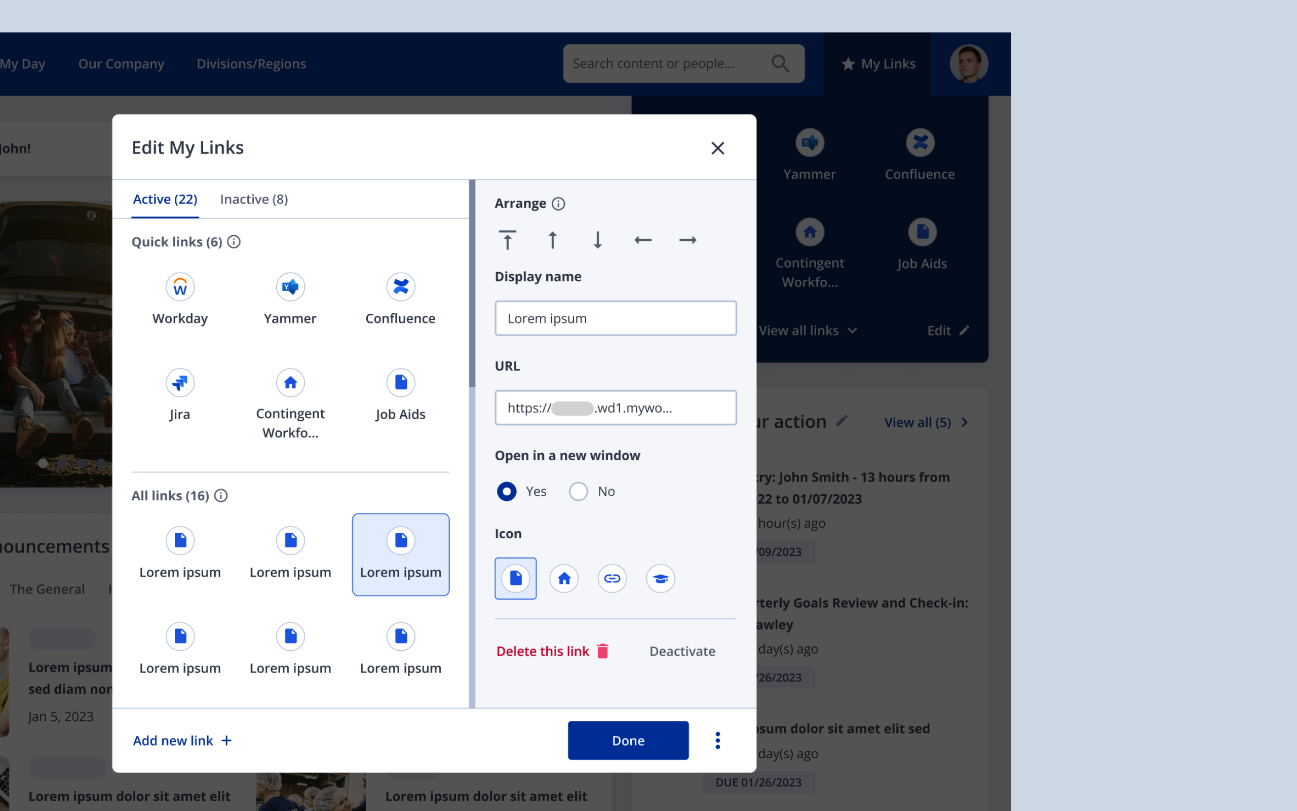
Link editing interaction model redesign
I designed a link editing modal to make the link customization simple and intuitive.
- Simplicity: Users can customize their links without leaving homepage. And the object-centered interaction model simplified UI by reducing the number of action components. User can just select a link on the left and then edit the properties and take more action of it on the right side.
- Efficiency: The consistent display of the positions of links on homepage and in the editing modal makes it easier to learn and use.
Iterations based on feedback
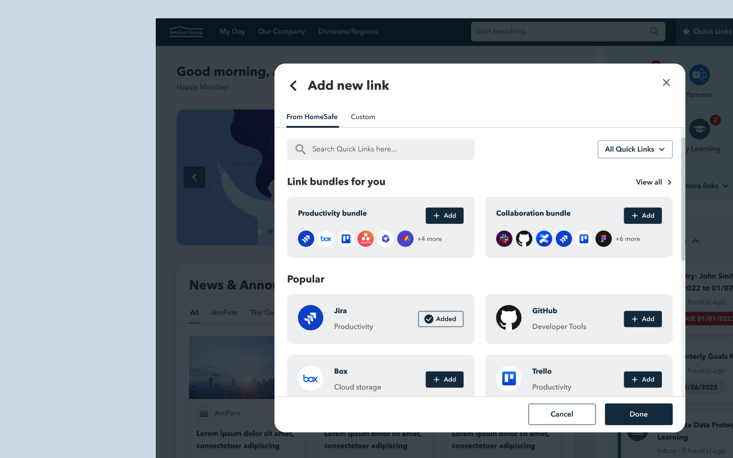
From stakeholders’ feedback on the needs for batch adding common links, besides custom link creation, I added a new batch import feature for users to directly select from a list of curated sets of most common links in various categories.
Design process (2): A robust search feature
Problems & Goal
Search is a frequently used feature on HomeSafe's intranet. Both corporate and field employees use it to search for articles, people, work tools, and files. According to the research, the current search feature is hard to use because:
- Search bar is not explicit, hidden by default on homepage.
- There are two separated search bars for people and content search bars due to different databases. This causes complexity on users’ end.
- The article/file results don’t show the date. Users have to take an extra click to see the date info.
As a result, the design goal is to reimagine a simpler and more robust search feature vision based on the tech enablement from EY tech consulting team.
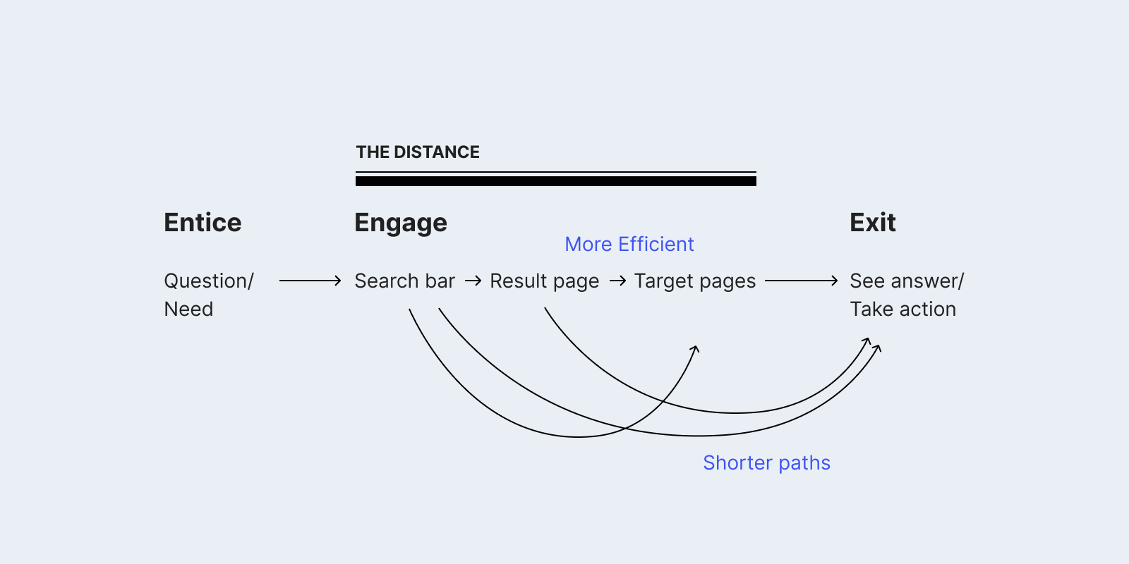
Improve search usability via shortening the distance from questions to answers.
Efficiency is a big part of usability. I took two approaches to improve the efficiency of search:
- Make the existing experience path more efficient: Enhance the experience on the search bar and result page, including exposed search bar by default, autocomplete, clear organization of content types, and faceted filters.
- Create shorter experience paths: Enable users to take a shorter path to get common answers or take common actions, like rich predictive search feature and result snippets with quick actions.
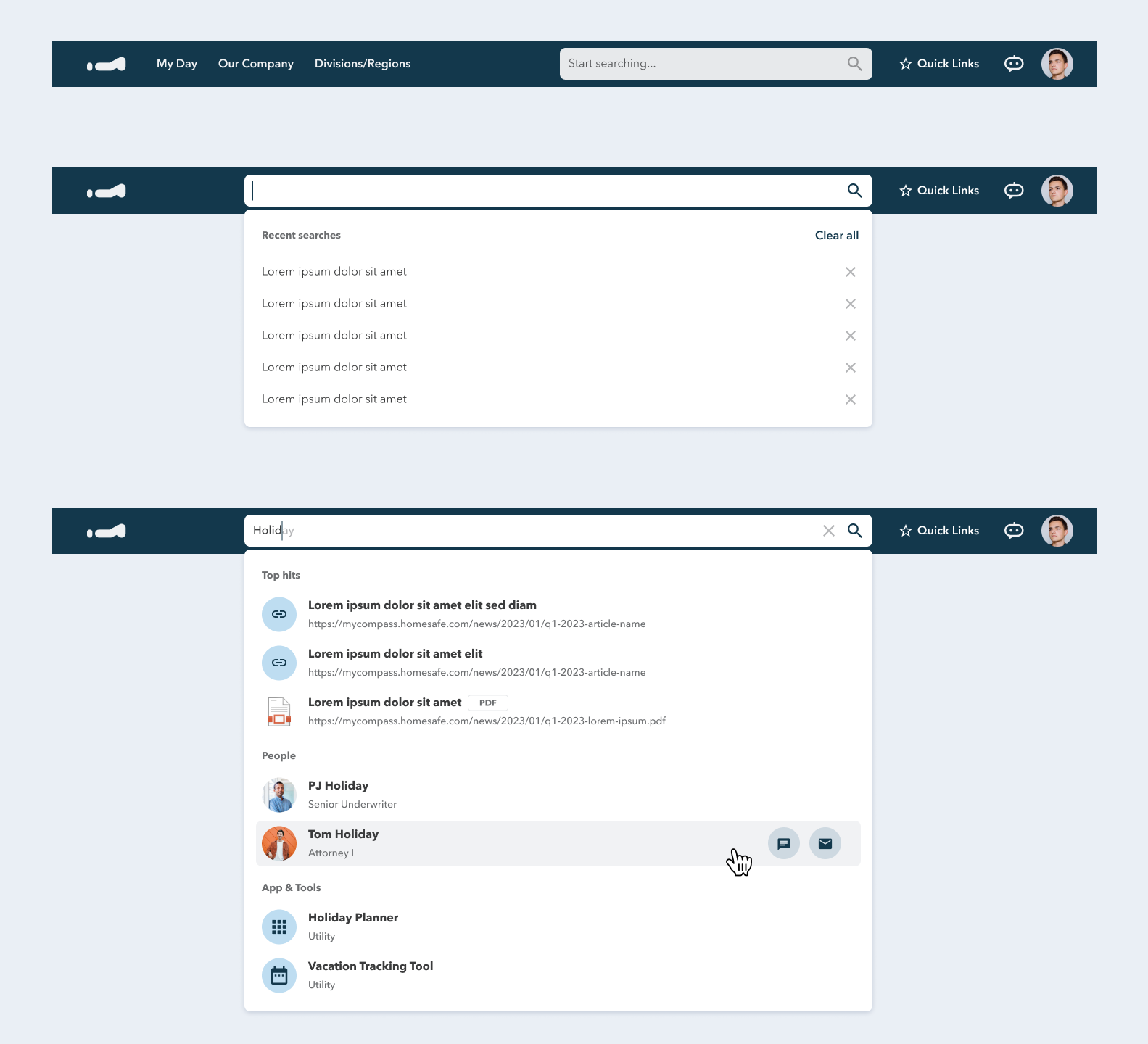
A robust predictive search
Predictive search is a key opportunity to simplify search UX, since the simplest experience would be the user can find what they are looking for without even getting to the result page. For making predict search more robust:
- Search history: It helps users quickly access the results of the keywords they searched for.
- Auto-complete: As the user is typing in the search field, the program can provide auto-complete suggestions to increase search efficiency.
- Rich predictive result dropdown: Users can conveniently see different categories of search results on the result dropdown when they are typing in the search bar.
- Quick actions on hover: Users can directly take relevant actions directly in this dropdown without going to the search result page.
Convenient search result snippets with quick actions
The new snippet feature enables users to directly see the content inside popular search results without going to another page. Users can also quickly take relevant actions on snippets.
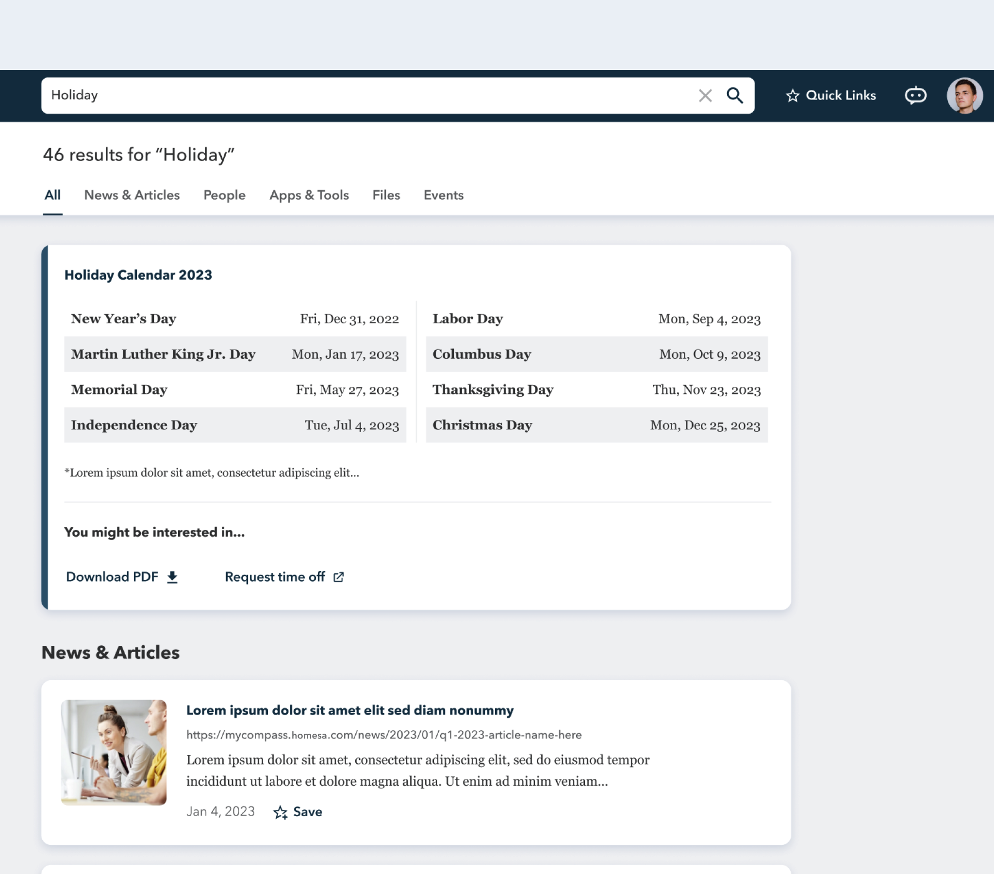
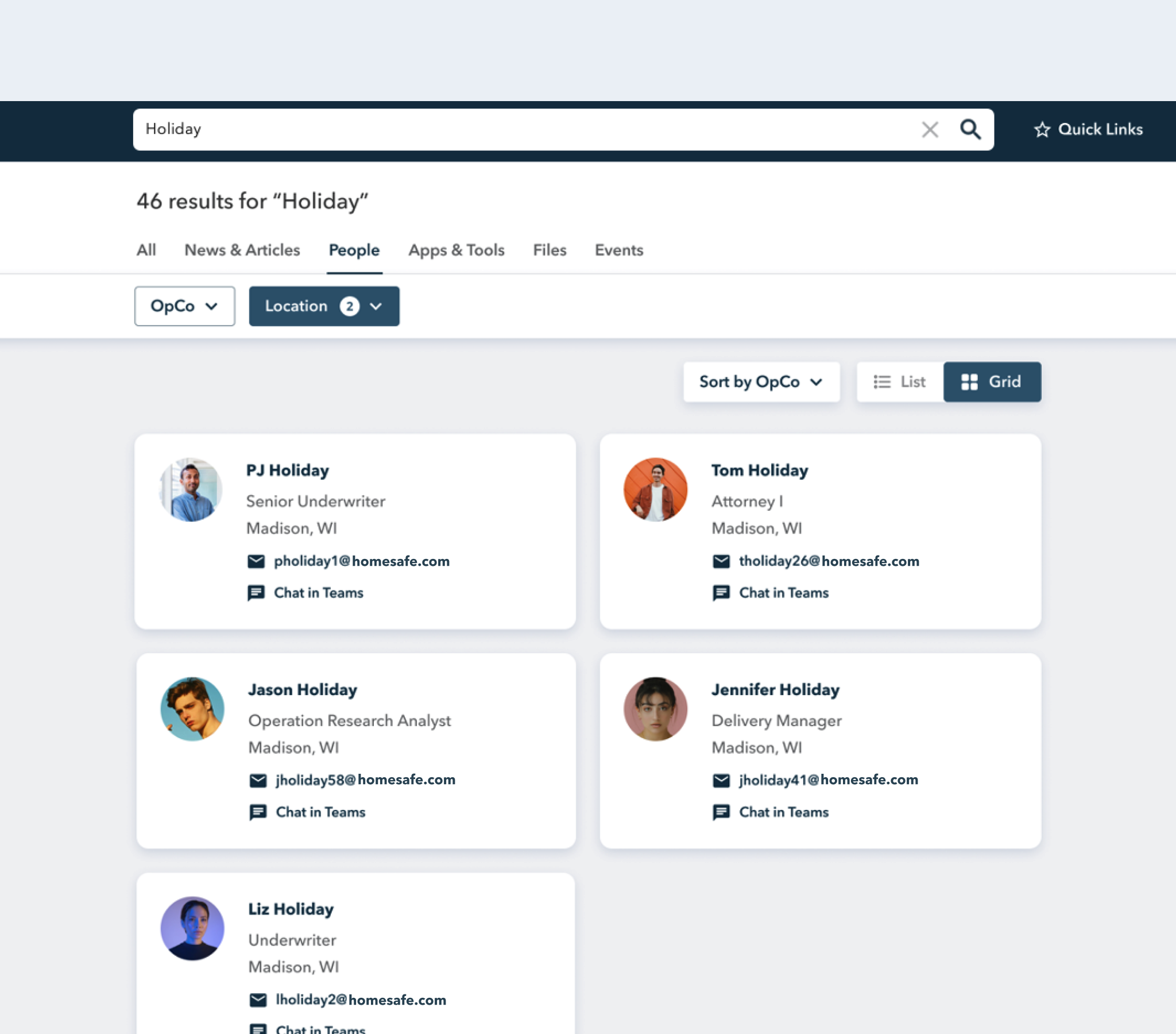
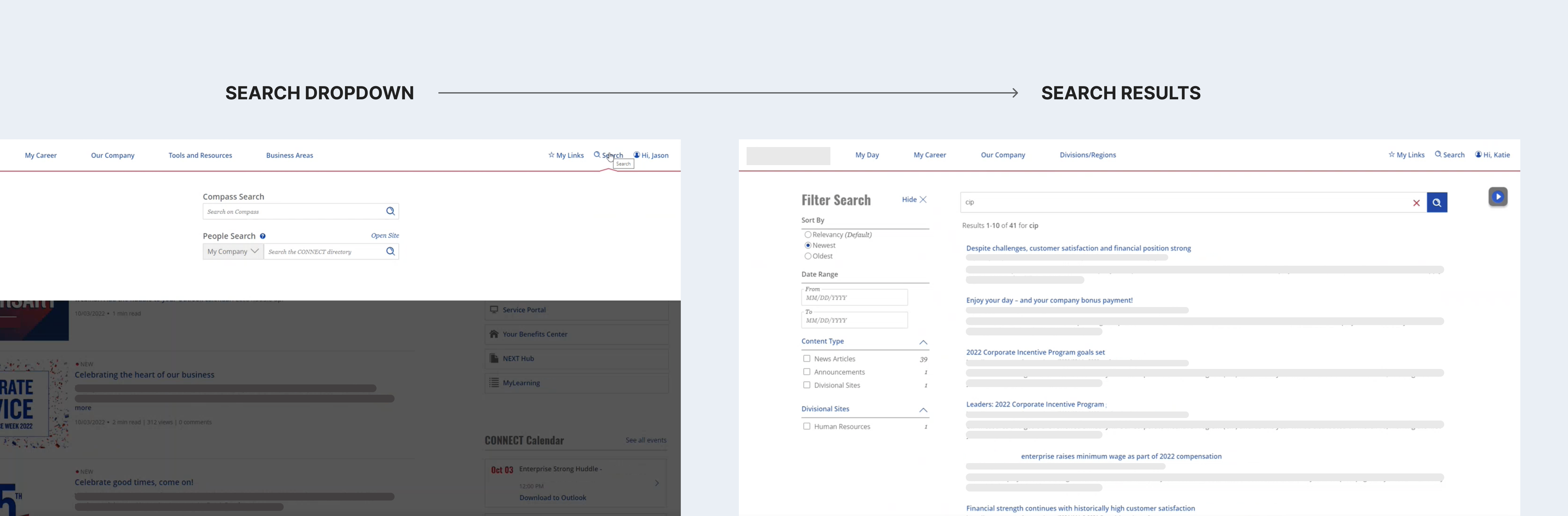
A clearer result page structure with faceted filters
- Result category tabs: Users can view the search results in a specific result category by clicking on the corresponding tab.
- Faceted filers: Users can use filters to scope down the search results.